

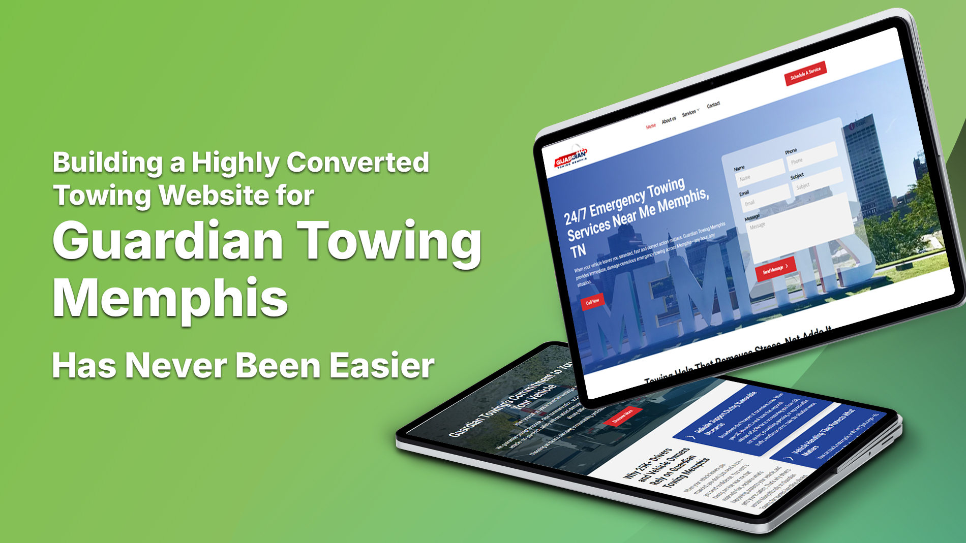
In emergency-based industries, trust is not something you earn gradually; it’s something you must communicate instantly. When someone searches for a towing company, they aren’t browsing. They’re stranded, under pressure, and making a fast decision based on very little information. In that moment, a business either feels dependable, or invisible.
This is why towing websites often fail before they even begin. Many are built without strategy, disconnected from how towing actually works. Others never exist at all. Without a digital presence, even the most experienced towing company risks being overlooked simply because it doesn’t appear when help is needed most. In today’s environment, no website doesn’t mean no business; it means no visibility at the exact moment visibility matters.
That reality defined the opportunity with Guardian Towing Memphis.
Guardian Towing Memphis had been serving the community for nearly three decades. The experience was there. The operational knowledge was there. The reputation existed offline. But digitally, there was nothing, no website, no Google Business Profile, no social presence. From an online perspective, a 30-year towing operation was effectively invisible. Not because the business lacked credibility, but because that credibility had never been translated into a digital form.
For Selecta Sol, this wasn’t a redesign project. It was a foundation built.
Starting from scratch meant more than creating pages. It meant defining a digital identity for a company that had already proven itself on the road for years. Every decision (structure, messaging, services, and layout) had to respect the weight of that experience while making it accessible to modern customers who rely entirely on search and mobile devices during emergencies.
This project mattered to Selecta Sol because it represented what we believe strong digital work should do: give established businesses the online presence they deserve. We weren’t tasked with inventing a brand. We were tasked with revealing one, carefully, accurately, and with respect for an industry where trust isn’t optional.
From day one, the goal was clear. Build a website that feels like the company itself: steady, prepared, and ready when someone needs help right now.
Understanding the Towing Industry Before the Pitch
Before any proposal, design, or timeline, we focused on understanding the industry itself. Towing is not a typical service category. It operates at the intersection of urgency, safety, and trust, where decisions happen fast and hesitation costs time. To build a website that truly works for a towing company, you first have to understand how both customers and operators experience those moments.
When towing customers search for help, they are rarely calm. They might be stuck on the roadside, dealing with an accident, or facing a vehicle that won’t start at the worst possible time. Under stress, people don’t read; they scan. They look for signs of legitimacy, clarity, and responsiveness. A phone number that’s easy to find. Services that are clearly listed. Language that feels steady, not sales-driven. Anything that feels vague, cluttered, or exaggerated immediately raises doubt.
Towing business owners, on the other hand, need something very different from their website. They don’t need flashy animations or trendy design elements. They need a digital asset that works like an extension of their operation. That means clear service definitions, local relevance, strong credibility signals, and a structure that encourages calls without creating confusion. A towing website should support dispatch, not distract from it. It should reduce unnecessary questions and remind customers they’re dealing with experienced professionals.
Over the years, we’ve seen the same mistakes repeated across towing websites. Generic templates borrowed from unrelated industries. Overloaded pages filled with buzzwords but no real information. Services lumped together without explanation. Weak calls to action. And most commonly, websites that try to look impressive instead of trying to be useful. In an emergency-based industry, usefulness always wins.
With Guardian Towing Memphis, the challenge was unique. There was no existing website to critique or redesign. Instead, we examined the business itself. How long it had been operating, how it handled calls, how it served the local community, and how it built trust offline. Nearly 30 years of real-world experience told us everything we needed to know about what the digital presence should communicate.
By observing the strength of their operations, their consistency, and their reputation in the field, Selecta Sol identified the real gap: not capability, but visibility and structure. The business already did the hard part, showing up and delivering in real-world situations like flat tire change, dependable tire repair, and urgent tire replacement calls. Our role was to translate that reliability into a digital experience that made sense to stressed customers and supported the way a towing company actually works.
That understanding shaped the pitch before it was ever presented.
The First Conversation With Guardian Towing Memphis
The first conversation with Guardian Towing Memphis didn’t begin with excitement or immediate agreement. It began with hesitation, and that honesty set the tone for everything that followed. After nearly 30 years in business without a website, the question wasn’t how to build one. It was why one was even necessary.
The initial contact happened through a straightforward outreach, not a polished sales pitch. From the beginning, the owners of Guardian Towing Memphis were clear about their position. The business had survived (and grown) on referrals, repeat customers, and reputation alone. Phones rang without a website. Trucks stayed busy without online marketing. From their perspective, a website felt optional, not essential.
Instead of pushing features or making assumptions, we listened.
That first conversation focused less on convincing and more on understanding. We asked how customers usually found them, what kinds of calls caused the most frustration, and when demand spiked unexpectedly. We listened as they explained how trust had always been built face-to-face or over the phone, not through screens. That skepticism wasn’t resistance; it was earned confidence from decades of doing the work right.
The questions that shaped the project came directly from that exchange. What happens when someone new moves to Memphis and needs a tow for the first time? How do customers verify legitimacy when they don’t already know the company? What appears when someone searches during an accident or breakdown? These weren’t marketing questions; they were operational realities.
Slowly, the conversation shifted. Not toward selling a website, but toward acknowledging a change in how customers behave under pressure today. We discussed how a digital presence doesn’t replace reputation; it supports it. How a website doesn’t create trust, but it signals it to people who have no prior connection to the business.
Aligning expectations early was critical. We made it clear that this wouldn’t be about flashy design or unnecessary marketing. The goal was simple: build a website that reflects the business Guardian Towing Memphis already is—one that answers questions quickly during moments like a battery jumpstart, provides clarity around jump start service options, and builds trust when customers need battery replacement support. One that feels credible instantly and supports the same professionalism they’ve delivered on the road for decades.
By the end of that first conversation, there was no hard sell, only mutual clarity. And that clarity laid the groundwork for everything that came next.
How Selecta Sol Pitched the Vision
By the time we presented our vision, the conversation had already moved beyond whether a website was necessary. The focus shifted to what kind of website would actually serve their business. Our approach was intentional: authority without arrogance, clarity without pressure.
We began by reframing the idea of a website altogether. We explained that what we were proposing wasn’t a digital brochure or a static online presence. It was a conversion system. One designed to work in real-world towing scenarios. In emergency situations, a website’s job is not to impress. Its job is to reduce hesitation, answer questions quickly, and guide someone toward calling with confidence. Every page, every heading, and every call to action must serve that purpose.
From there, we presented a towing-specific digital strategy. We discussed how towing customers behave under stress, how they scan rather than read, and why service clarity matters more than clever language. We outlined a structure built around real towing services—clear solutions like vehicle unlocking, fast-response car lockout service, reliable fuel delivery service, and critical accident recovery—not generic categories. Each service would stand on its own, clearly explained, easy to find, and internally connected so users could navigate without confusion. This wasn’t theory; it was grounded in how towing businesses actually operate day to day.
We also addressed the elements that often get overlooked but matter deeply in search and trust. We explained how Google’s EEAT principles apply naturally to towing: experience shown through clear service explanations, expertise demonstrated by confident and accurate language, authoritativeness built through structure and consistency, and trust earned through transparency. Local visibility was another critical point. When someone searches during an emergency, proximity and legitimacy decide the call. The website needed to signal both instantly.
Emergency usability tied everything together. We walked them through how the site would function on a phone, with minimal friction, fast load times, and obvious contact points. No distractions. No unnecessary steps. Just clarity when it matters most.
The pitch resonated because it didn’t ask them to change who they were. It showed how their existing professionalism, experience, and reliability could be translated into a digital form that made sense for today’s customers. We weren’t proposing something new; we were proposing something accurate.
That alignment is what turned a cautious conversation into a shared vision.
Closing the Project With Confidence
Once the vision was clearly understood, the conversation naturally moved into decision-making. This stage wasn’t about persuasion; it was about addressing what still felt uncertain. After decades of operating without a digital presence, they had valid concerns. Would a website actually change anything? Would it create unnecessary complexity? Would the investment justify itself in a business where speed and reliability already drove success?
We addressed those concerns directly, without minimizing them. We explained what the website would do and would not do. It wouldn’t interfere with their operations or replace the systems they already trusted. Instead, it would support them by capturing demand that currently went unanswered and by reinforcing credibility for customers who had no prior relationship with their business. The goal wasn’t transformation for its own sake. It was reinforcement.
From there, we clarified scope with precision. We outlined exactly what would be built, how the site would be structured, and why each component existed. Timelines were realistic, not rushed. Outcomes were framed in terms of clarity, visibility, and usability rather than inflated promises. We made it clear that success would be measured by how well the site supported calls, trust, and local discovery—especially for critical services like accident scene cleanup and dependable car recovery, not vanity metrics.
Establishing trust at this stage mattered more than closing quickly. We positioned the project as a partnership, not a handoff. Our role was to guide strategy, execution, and decision-making, while respecting their experience in the towing industry. That mutual respect created confidence on both sides, reinforced by clearly defined offerings such as winch out service, off-road recovery, and specialized motorcycle towing. There was no pressure to move forward, only clarity about what moving forward would look like.
The moment the project was approved didn’t feel dramatic. It felt steady. They were comfortable with the direction, confident in the process, and aligned with the purpose. What began as skepticism had turned into trust grounded in understanding.
With that approval, the work officially began, but more importantly, the partnership was established.
Planning the Website: Strategy Before Design
Before a single layout was designed or a line of code was written, we focused on planning. In towing, clarity always comes before creativity. A website can only perform well if it mirrors how customers behave in real situations, especially when stress and urgency shape every decision.
We started by mapping the towing customer journey from the first moment of panic to the final phone call. Most users arrive with one goal: get help quickly. That understanding guided every structural choice. We identified where hesitation usually happens, what information reassures people fastest, and how to remove unnecessary steps between search and contact. The journey had to feel calm, predictable, and direct.
Navigation was structured with speed in mind. We avoided overloaded menus and confusing labels. Instead, we prioritized clear service categories, logical page flow, and immediate access to contact information. Visitors shouldn’t have to think about where to go next. The site needed to guide them naturally, even when they were scanning quickly under pressure—especially when searching for dependable services like SUV towing or truck towing.
Deciding what information mattered most during emergencies was a critical step. We focused on the essentials: services offered, service areas, availability, and clear calls to action. Anything that didn’t serve those priorities was removed or deprioritized. In towing, less clutter creates more confidence, particularly for specialized needs such as RV towing and motor home towing.
Mobile-first planning shaped the entire experience. Most towing searches happen on phones, often from the roadside. We planned layouts that load fast, read cleanly on small screens, and make calling effortless. Buttons were placed where thumbs naturally land, supporting urgent scenarios like boat towing without forcing users to hunt for help. Content was broken into digestible sections that don’t overwhelm users in stressful moments.
SEO and EEAT considerations were embedded from day one, not added later. We planned content structures that clearly demonstrate experience, expertise, and trust. Service pages were designed to stand on their own while supporting internal linking and local relevance. The goal was visibility that feels earned, not forced.
By the time planning was complete, the website already existed in principle. Design and development would simply bring that strategy to life.
Structuring the Core Pages
With the strategy clearly defined, we moved into structuring the core pages of the website. This phase focused on architecture. How information is organized, prioritized, and presented so it works naturally for both users and search engines. In towing, structure isn’t a design choice; it’s a usability requirement.
The homepage had one primary goal: immediate reassurance. We designed its messaging hierarchy to answer the most important questions within seconds. Who they are. What they do. Where they operate. And how to get help right now. Everything else was secondary. The language was direct, the layout was intentional, and calls to action were visible without feeling aggressive. The homepage needed to function like a calm first response, not a sales pitch.
From there, we built a service-based structure designed for clarity and long-term rankings. Each towing service was given its own dedicated page rather than being grouped into vague categories. This approach serves two purposes. For users, it creates confidence through clear explanations of what’s available—whether they need classic car towing, careful luxury vehicle towing, or specialized exotic car towing. For search engines, it establishes topical relevance and authority. Each service page supports the others through internal linking, forming a connected system rather than isolated pages.
Location relevance was another foundational element. Guardian Towing Memphis operates in a specific geographic context, and the website needed to reflect that clearly. We structured content to reinforce local presence without forcing it. Services such as enclosed vehicle transport and flatbed towing were positioned within that context naturally, helping users feel certain they were contacting a nearby, legitimate operator—not an anonymous directory listing.
Contact and CTA placement followed real-world behavior. We positioned phone numbers and contact prompts where urgency naturally peaks, at the top of pages, after key service explanations, and at logical decision points. The goal wasn’t to overwhelm visitors with calls to action, but to ensure that when they were ready, taking the next step felt effortless.
By structuring the core pages this way, we created a foundation that supports speed, trust, and visibility, exactly what a towing website needs to perform under pressure.
Writing for a Towing Audience Under Pressure
Writing for the towing industry demands a different level of discipline. In emergency situations, words don’t just inform; they influence decisions instantly. That’s why a towing copy cannot sound generic. Phrases borrowed from unrelated industries or overly polished marketing language create distance instead of trust. When someone needs a tow, they’re not looking for clever messaging. They’re looking for confidence that the company knows exactly what it’s doing.
We focused on using real towing language. terms and explanations that reflect how towing services actually operate. Services were described clearly and accurately, without exaggeration or ambiguity. This kind of language signals experience. It tells readers they’re dealing with professionals who understand roadside realities, not a business hiding behind vague promises.
Balancing urgency with reassurance was one of the most important challenges. The copy needed to acknowledge urgency without amplifying stress. We avoided alarmist language and instead focused on a steady, confident tone. The goal was to let visitors feel that help is available and under control, whether they require precise wheel lift towing, careful low clearance towing, or specialized underground garage towing. Calm authority is far more effective than dramatic urgency in building trust.
Every section was written to build trust in seconds. Headings communicate clarity at a glance. Short paragraphs support scanning. Key information appears early so visitors don’t have to search for reassurance. For larger or more complex needs, clear explanations around wrecker service and dependable commercial towing reduce hesitation. In a high-pressure situation, even small moments of doubt can cost a call. The content was structured to prevent that hesitation.
Avoiding fluff and overpromising was non-negotiable. We resisted the temptation to claim perfection or make guarantees that don’t reflect real operations. Instead, we let clarity, experience, and transparency do the work. In towing, honesty builds more confidence than hype ever could.
The result is a copy that feels grounded, professional, and reliable, exactly what people need when they’re making decisions under pressure.
Building the Service Pages as a System
Because Guardian Towing Memphis had no website before this project, we weren’t reorganizing or consolidating existing service pages. We were defining their full scope of work digitally for the first time. That required us to think the way towing customers think, by problem, not by category, and to structure the site so every real-world situation had a clear, dedicated destination.
We began with the most time-sensitive needs, making sure visitors who required immediate help could quickly find pages like 24 hour towing, emergency towing, local towing, and roadside assistance. These pages were positioned and written to remove hesitation and confirm availability without overwhelming someone already under stress.
From there, we mapped the most common roadside breakdown scenarios. Flat tire situations were separated into flat tire change, tire repair, and tire replacement, reflecting how different the outcomes and expectations can be. Battery-related problems followed the same logic through battery jumpstart, jump start service, and battery replacement, while access issues were addressed through vehicle unlocking and car lockout service. Fuel-related breakdowns pointed directly to fuel delivery service, ensuring clarity for a very specific need.
Accidents and recovery work required even more precision. Someone involved in a collision has different concerns than someone stuck in mud or a ditch, which is why services such as accident recovery, accident scene cleanup, car recovery, winch out service, and off road recovery each exist as their own clearly explained service rather than being grouped under a single generic heading.
Vehicle type also plays a major role in how people search and how trust is built. That’s why we created distinct paths for motorcycle towing, suv towing, truck towing, rv towing, motor home towing, and boat towing, allowing visitors to immediately confirm that their specific vehicle could be handled safely.
For high-value and specialty vehicles, trust depends entirely on specificity. Pages like classic car towing, luxury vehicle towing, exotic car towing, and enclosed vehicle transport were written to communicate care, experience, and proper handling without exaggeration.
Access limitations and towing methods were addressed just as deliberately. Services such as flatbed towing, wheel lift towing, low clearance towing, underground garage towing, and wrecker service reflect real-world constraints customers actively search for when standard towing options won’t work.
Commercial and property-related services required a different structure and tone altogether. We built separate pages for commercial towing, fleet towing, dealer towing service, police towing, private property towing, impound towing, illegally parked vehicles, and abandoned vehicle towing, recognizing that these services involve different decision-makers and responsibilities.
Finally, we addressed transport, logistics, and operational needs that go beyond roadside emergencies. Pages like transport towing, long distance towing, relocation towing, machinery towing, vehicle storage, auction vehicle towing, junk car removal, and disabled vehicle towing ensure the site reflects the full operational scope of the business.
In addition to customer-facing towing needs, we also structured pages for more specialized operational work that reflects the depth of equipment and capability Guardian Towing Memphis brings to bigger jobs. For clients who need more than light towing, we included medium duty towing and heavy duty towing to show that buses, large trucks, and commercial vehicles are within their expertise spectrum. We also gave proper attention to transport needs that require enclosed protection or care beyond standard roadside service by adding enclosed vehicle transport, ensuring the site speaks confidently to customers with specialized cargo, collections, or high-value vehicles that need covered transport rather than open-bed towing.
By embedding these services naturally and connecting them through real-world logic, we built more than individual pages. We created a system that mirrors how Guardian Towing Memphis actually operates; structured, experienced, and ready for any situation that comes next.
Visual Direction & Graphic Design Decisions
Once the structure and content were in place, visual direction became about restraint rather than expression. In the towing industry, design doesn’t exist to decorate; it exists to reassure. Every visual decision needed to support clarity, speed, and trust, especially for users arriving under stress.
We anchored the color system around two core tones: deep blue and red. The deep blue establishes reliability, professionalism, and calm authority. It’s the color that carries the brand’s weight and experience, especially in environments where long-term partnerships matter, such as fleet towing and dependable dealer towing service operations. Red was used deliberately, not excessively, to signal urgency and action. It highlights calls to action, critical information, and moments where a decision needs to happen quickly—appropriate for high-stakes services like police towing. The balance between these two colors ensures the site feels responsive without feeling aggressive.
Typography choices followed the same logic. We prioritized clean, highly legible fonts that perform well on mobile screens and in low-light conditions. Line spacing, font weight, and hierarchy were all tuned for scanning rather than reading. Headings communicate meaning instantly, while body text stays comfortable and unobtrusive. This clarity matters when users navigate structured services such as private property towing or regulated processes like impound towing. Under pressure, typography should never slow someone down, and this system was built to stay invisible while doing its job.
Iconography and imagery were selected to reinforce towing credibility, not visual flair. Icons are simple and functional, helping users understand services at a glance without adding cognitive load. Imagery reflects real towing scenarios (trucks, recoveries, roadside assistance) used sparingly and intentionally. Nothing feels staged or decorative. Every visual element exists to support authenticity.
Performance guided every design choice. The layout stays clean, the pages load fast, and distractions are kept to a minimum. There are no unnecessary animations, no visual noise, and no elements competing for attention. The result is a design that feels steady and dependable, exactly how a towing company should feel when someone needs help immediately.
This visual system doesn’t try to impress. It tries to work. And in an emergency-based industry, that’s what earns trust.
Turning Strategy Into a Live Website
With strategy, structure, content, and design aligned, the project moved into execution. This phase was about precision. A towing website doesn’t just need to look right; it needs to work reliably in real conditions, often when someone is standing on the roadside using a phone with limited attention and patience.
Our development workflow followed a deliberate sequence. We translated approved designs into clean, lightweight code, building page by page to preserve clarity and consistency. Each component was implemented with the end user in mind, ensuring that layouts, buttons, and navigation behaved exactly as intended. Nothing was rushed. Every element had a defined purpose and a place within the system we had already planned, supporting clearly defined services such as illegally parked vehicle removal and abandoned vehicle towing.
Performance and speed were treated as non-negotiable. We optimized assets, limited unnecessary scripts, and ensured that pages load quickly even on slower mobile connections. In emergency scenarios, seconds matter—whether someone needs straightforward transport towing, dependable long-distance towing, or time-sensitive relocation towing. A slow-loading site can create doubt or frustration, and that’s a risk we weren’t willing to take. Speed wasn’t just a technical goal; it was a trust signal.
Mobile responsiveness testing played a central role throughout development. We tested the site across screen sizes, devices, and orientations to make sure content remained readable, buttons remained accessible, and calls to action stayed obvious. The experience needed to feel natural whether someone was holding a phone with one hand or navigating on a desktop after an accident.
Ensuring clarity across devices meant revisiting content placement and spacing at every breakpoint. Headings had to remain scannable. Phone numbers had to stay visible. Service information needed to stay easy to digest without requiring zooming or excessive scrolling. The site was adjusted repeatedly until it felt intuitive everywhere.
Before launch, we conducted final quality checks with the same discipline used at the start of the project. Links were verified, forms were tested, page flow was reviewed, and content was checked for consistency and accuracy. Only when everything worked as expected did we move forward.
Turning strategy into a live website wasn’t about crossing a finish line. It was about delivering a digital platform that Guardian Towing Memphis could rely on. One that performs steadily, communicates clearly, and supports real-world towing operations from the moment it goes live.
Reviewing the Website With Guardian Towing Memphis
The review phase was where the work shifted from internal execution to shared reflection. Walking Guardian Towing Memphis through the finished website wasn’t treated as a handoff; it was a guided conversation. We approached it page by page, explaining not just what they were seeing, but why each decision had been made.
We began with the homepage, outlining how the messaging hierarchy mirrors the first few seconds of a real towing call. We showed how service clarity, location relevance, and contact visibility work together to create reassurance quickly. From there, we moved through the service pages, explaining why each one exists independently and how they connect naturally based on real towing scenarios—ranging from heavy-duty needs like machinery towing to practical considerations such as vehicle storage. The goal was to make the structure feel familiar, not technical.
As we walked through the site, their reactions were immediate and telling. There were moments of quiet recognition, seeing decades of work represented accurately online for the first time. The feedback wasn’t about colors or layout. It centered on clarity—how services like auction vehicle towing and straightforward junk car removal were easy to understand, how quickly someone could get help, and how professional the site felt without being overdone.
What stood out most to them was how closely the website reflected their actual operation. The language felt right. The services felt complete. The flow felt practical. For a business that had operated successfully for nearly 30 years without a digital presence, the site didn’t feel foreign or unnecessary. It felt like a natural extension of what they already did every day.
That moment confirmed the purpose of the entire project. The website didn’t introduce a new identity; it revealed an existing one, clearly and confidently, for the first time online.
The Client’s Final Reaction
The final reaction wasn’t dramatic, but it was deeply affirming. Seeing the completed website changed how Guardian Towing Memphis viewed their own business online. For the first time, their digital presence matched the professionalism, experience, and reliability they had built over decades on the road. What once felt invisible now felt established and legitimate.
They spoke openly about confidence, confidence in sharing the website with customers, partners, and even law enforcement or commercial contacts. The site gave them a clear, credible way to present who they are and what they do without having to explain it repeatedly. It became a reference point, not just a placeholder.
Most importantly, there was clear alignment between vision and execution. What we discussed in early conversations—clarity, trust, and usability—was present in the final result. The website didn’t overstate their capabilities or dress the business up as something it wasn’t. It reflected them accurately, including how clearly it communicates practical needs like disabled vehicle towing and dependable medium duty towing.
That alignment is what builds trust. Not just trust in the website, but trust in the process that led there. For Guardian Towing Memphis, the project validated that stepping into the digital space didn’t mean compromising their identity. It meant finally having a platform that represented it honestly—one that clearly supports serious capabilities like heavy duty towing and specialized needs such as enclosed vehicle transport without exaggeration or noise.
What This Project Represents for Selecta Sol
This project reinforced something we’ve always believed: industry-specific understanding isn’t optional; it’s foundational. Building a website for a towing company requires more than technical skill. It requires respect for how the industry operates, how customers behave under pressure, and how trust is formed in seconds. Without that understanding, even a well-designed site can miss the mark.
There were important lessons in building from the ground up for a business with nearly 30 years of offline experience. Starting with no digital footprint meant every decision carried weight. We learned again how critical listening is, especially when working with operators who know their business deeply but question the need for change. Progress didn’t come from persuasion. It came from clarity, patience, and alignment.
This project also reinforced our process-driven approach. Strategy came first. Structure followed. Content and design were shaped by real-world use, not trends. Development focused on performance and reliability. Each phase built on the last, leaving no gaps for confusion or rework. That process is what allows us to deliver consistency, even when the project itself is complex.
Most importantly, this work reflects our commitment to building websites that work, not just websites that look good. A site can be visually impressive and still fail its purpose. For Guardian Towing Memphis, success meant usability under stress, clear service communication, and trust at first glance. That’s the standard we aim for in every project.
This project wasn’t about showcasing creativity. It was about solving a real problem with discipline and care. And that’s exactly the kind of work Selecta Sol exists to do.
Closing Thoughts: Building More Than Websites
This project reaffirmed the value of partnership over production. The website didn’t come together because of isolated decisions or quick execution; it came together because both sides stayed aligned around purpose. When strategy, communication, and trust move in the same direction, the result feels intentional rather than assembled.
Websites should function as business tools, not templates. Especially in service-driven industries, a website must support real operations, real customers, and real moments of decision. When built correctly, it doesn’t just exist online; it works in the background, reinforcing credibility, reducing friction, and helping businesses show up clearly when it matters most.
For us, this project represents what’s possible when clarity leads and assumptions are set aside. Guardian Towing Memphis didn’t need to be reinvented. They needed a platform that reflected who they already were, accurately and confidently.
If you’re a business owner who values trust, clarity, and results, and you want a website built with purpose rather than shortcuts, Selecta Sol is ready to have that conversation.
Let’s build something that works when it matters.

Comments are closed